ABOUT LINKEDIN EVENTS.
The redesigned LinkedIn Events feature aims to simplify professional networking by enhancing event discoverability and improving the overall user experience. This updated design introduces a dedicated events page with intuitive filters, making it easier for users to find relevant networking opportunities based on their interests, industry, and goals. This redesign helps professionals connect with like-minded peers, expand their network, and advance their careers.
Role
UI/UX Designer & UX Researcher
0B66C2
Tools
Figma, FigJam, & Optimal Workshop
PROCESS.
TASK AT HAND.
As the solo UI/UX designer, my task was to create a mobile first responsive website with a focus on taking care of one’s health.
Problem Statement:
While LinkedIn allows users to create and join events, there are no filtering options for events, unlike job searches. Users can’t easily search by date, time, location (online or in-person), or distance, limiting their ability to find relevant opportunities, whether educational or casual networking meetups.
Introduce a dedicated event filter or category that allows users to refine searches by key criteria like date, time, venue, and location. This could also include a more accessible placement of the events section, such as a visible icon in the navigation bar or bento menu for faster access.
Solution:
PROJECT GOALS.
Design a responsive website that helps creates tailored routines to help users take ownership of their health journey.
BUSINESS GOALS.
Increase user engagement and efficiency (task completion times) while building a recognizable brand.
USER GOALS.
Achieve a healthier lifestyle (mental, physical, and dietary) and have flexible solutions and support using a user-friendly platform.
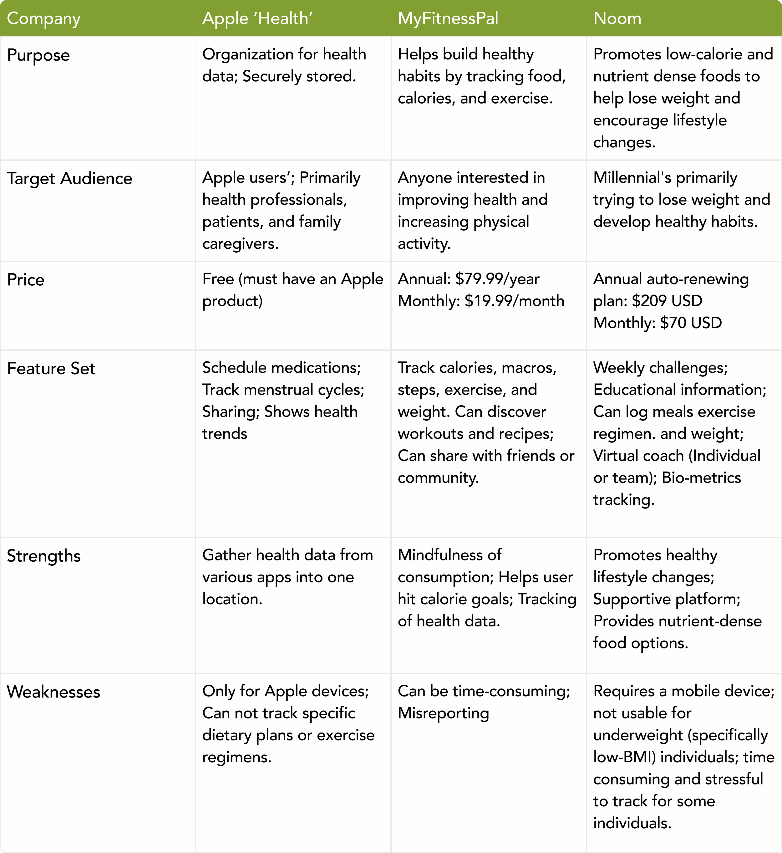
COMPETITIVE ANALYSIS.
Goals:
Identify key competitors.
Assess their strengths and weaknesses.
Uncover gaps in their products.
Key Takeaways:
All platforms enable users to track information, but each has limitations:
Apple: Limited to Apple users and lacks specific tracking features.
MyFitnessPal: Users find it time-consuming and prone to misreporting.
Noom: Restricted to individuals with a specific BMI, excluding underweight users.
INTERVIEW FINDINGS.
Interview Goals:
Determine what health goals users typically want to meet.
Understand how using this will fit into their daily lives with ease.
Determine and understand factors that prevent people from following routines or plans.
Interview Findings:
Users wanted a customizable health app.
Ability to choose their health journey.
Individuals wanted to increase their physical activity.
Most individuals were sedentary.
Users showed interest in customizable dashboards (summary page).
Current apps feel overwhelming and are information overload for users.
Users wanted consistent health routines.
Most were hindered by their schedules and daily responsibilities.
“I recognize that my dietary needs are different from others due to genetics, and health apps should cater to what works for me rather than a one-size-fits-all approach”
“...but just not being motivated, or just finding excuses to not do it that day. And I think part of it does come a little bit with just being a mom... So it’s hard to take that time away from family, even though you know you’re supposed to focus on your own goals and your own care.”
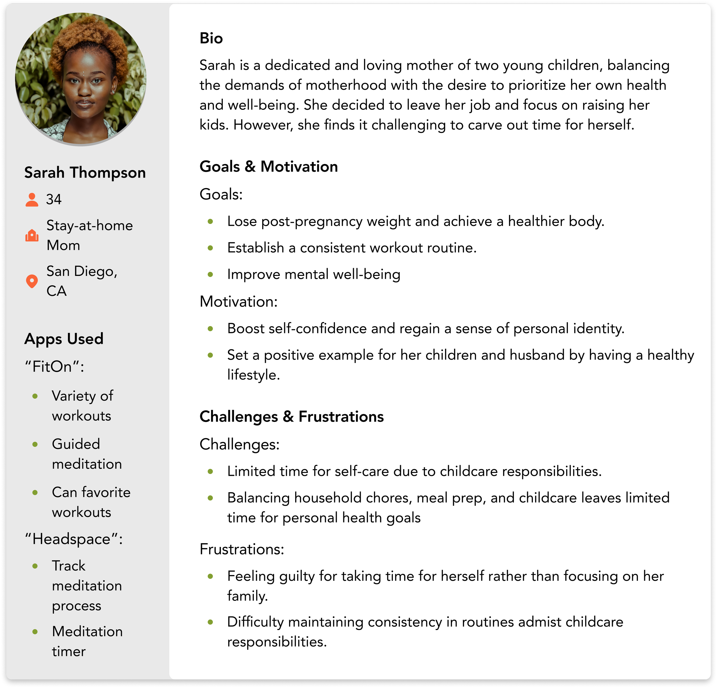
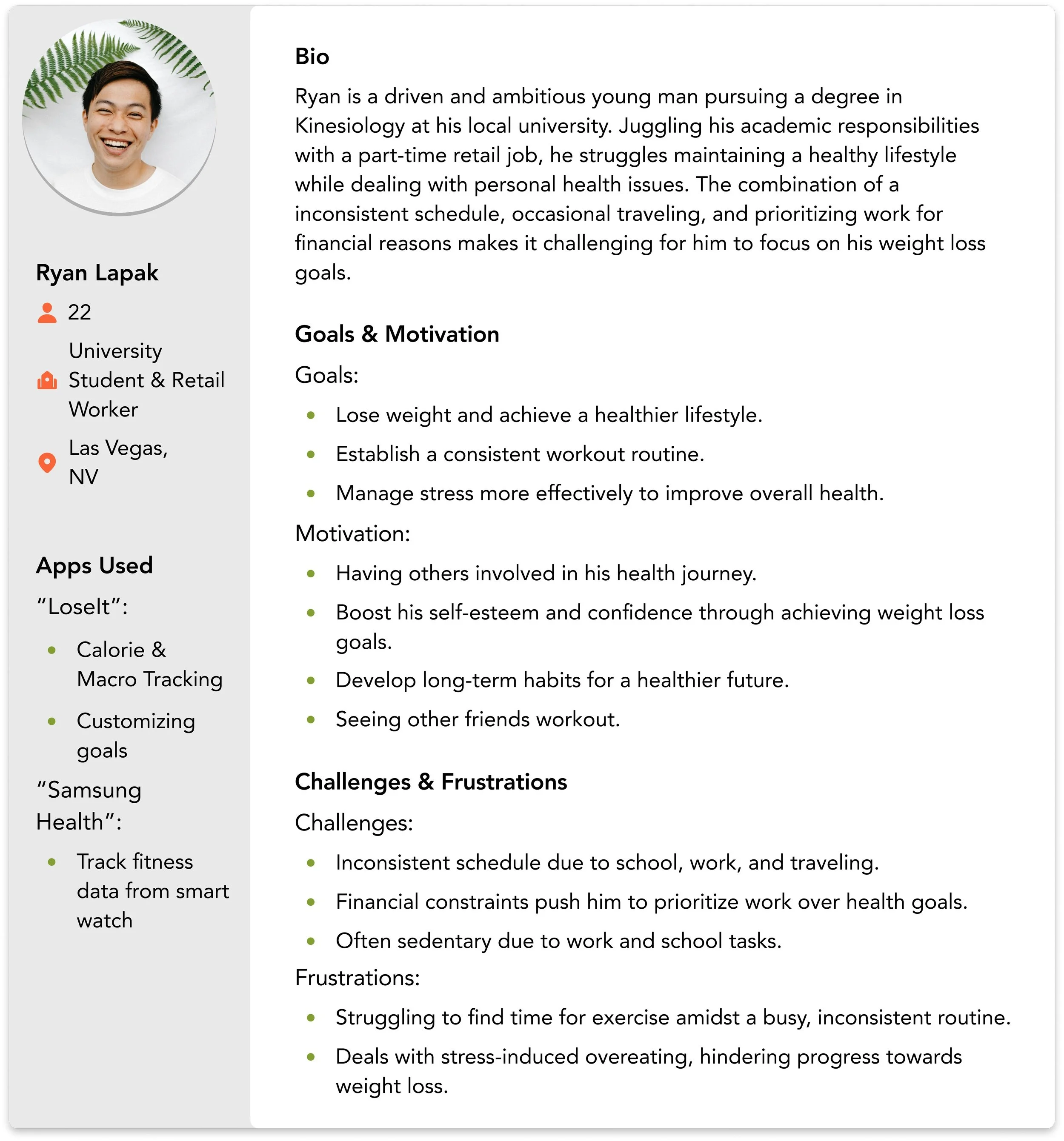
USER PERSONAS.
POV STATEMENTS.
POV Statement #1:
Users are unaware of LinkedIn's Event section, limiting their ability to discover and engage with networking opportunities.
How might we enhance the visibility and navigation of the Event section to make it a more prominent feature on LinkedIn?
POV Statement #2:
Users are discouraged from using the event feature due to the lack of filters, making it difficult to find events relevant to their interests.
How might we implement filtering options to help users quickly and easily find events that match their needs?
POV Statement #3:
The current event layout appears cluttered, overwhelming users and making it hard to absorb key event details.
How might we streamline the event information layout to present details in a more clear and digestible format?
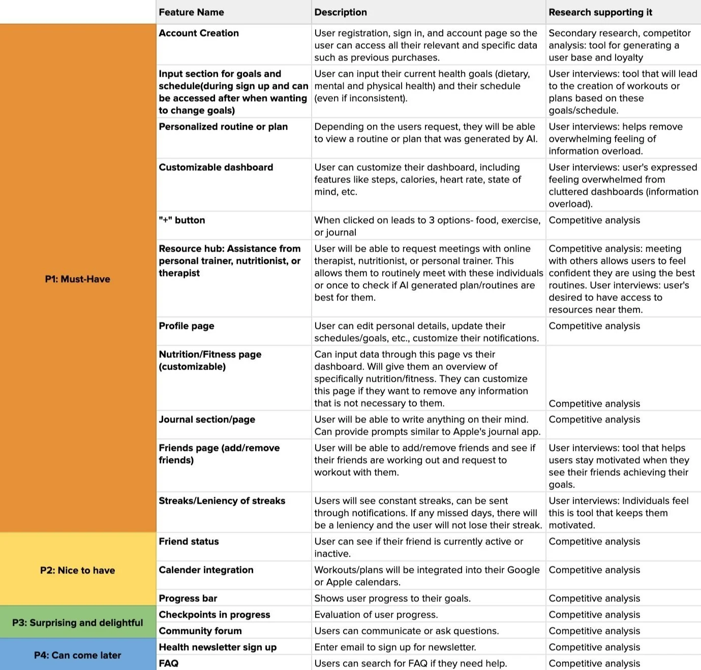
FEATURE ROADMAP.
Must- Have Features:
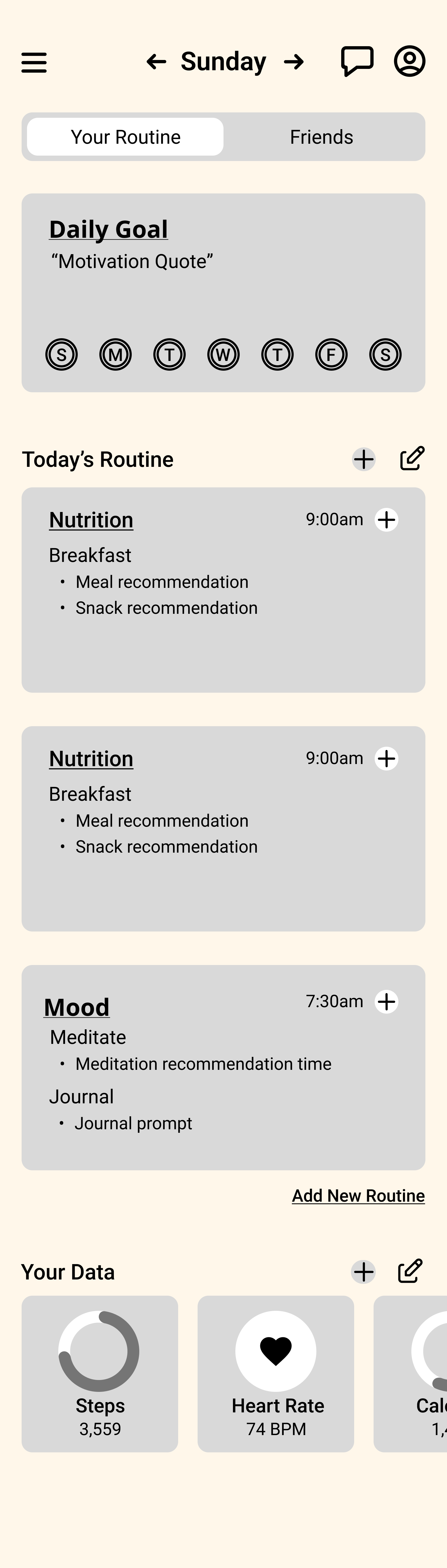
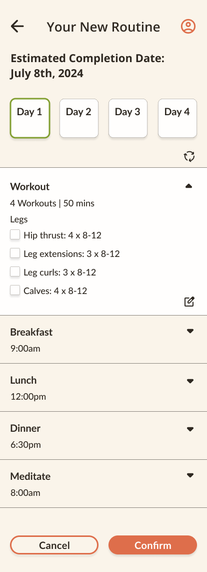
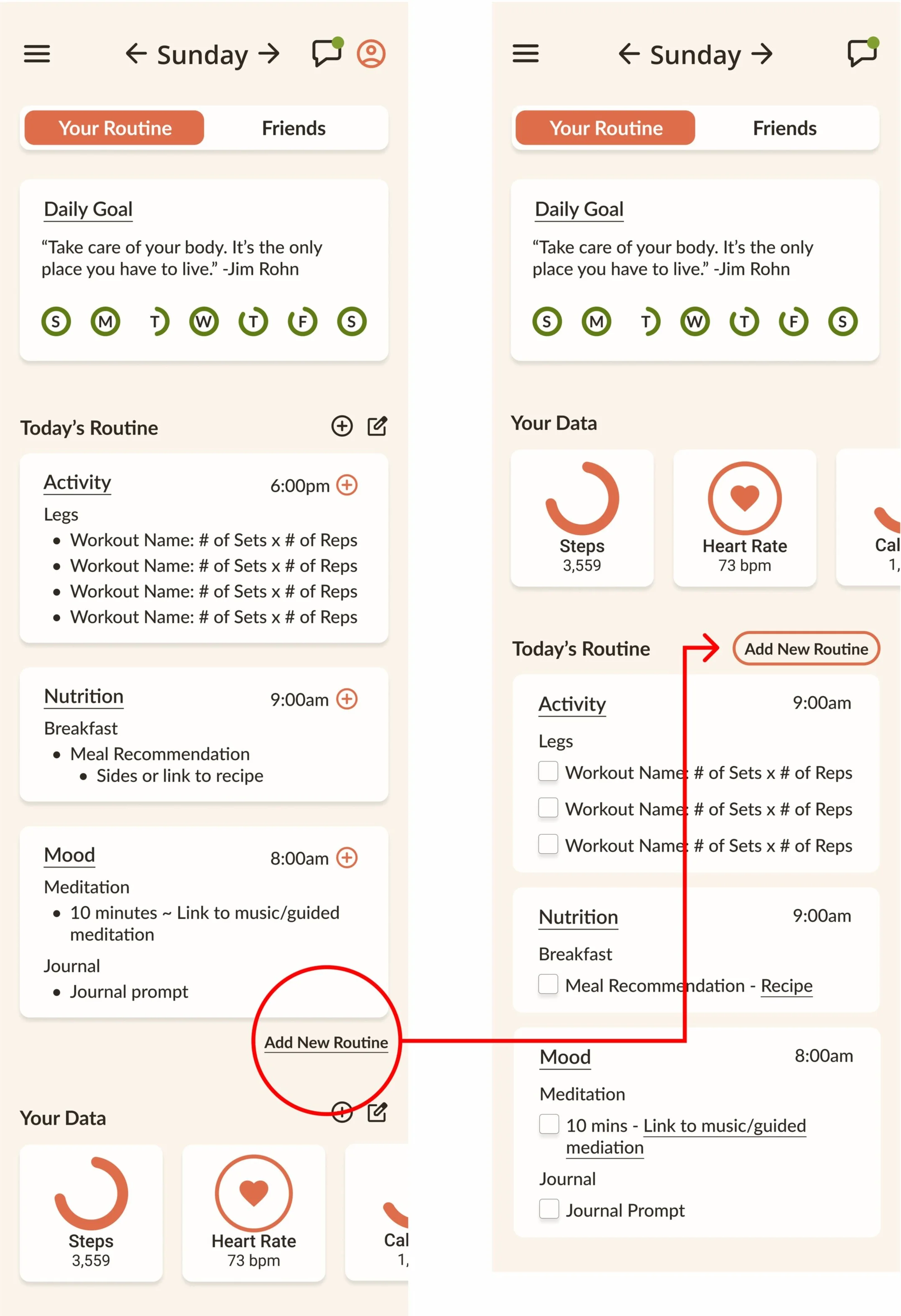
Based on user research, the app includes features such as personalized routines/plans, a resource hub, dedicated health pages (nutrition, fitness, journal, friends), and streaks to enhance user engagement.
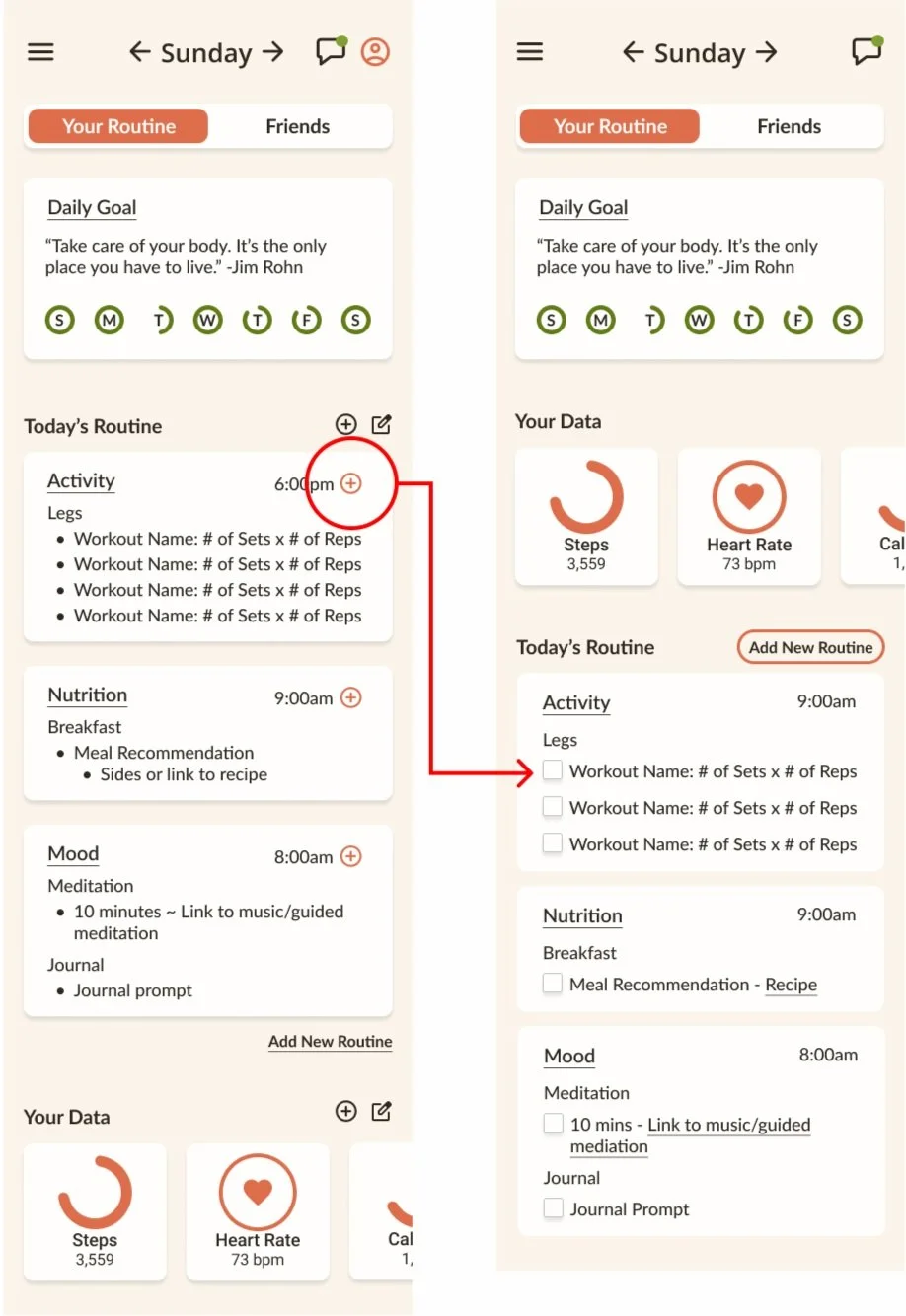
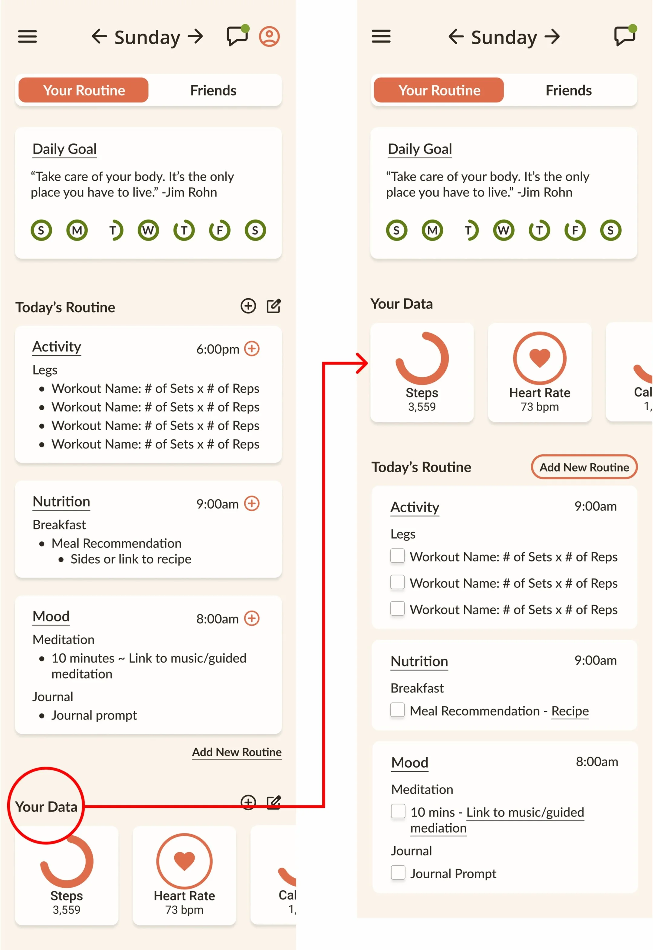
During prototype iterations, certain features were adjusted:
The fully customizable dashboard was removed to prevent users from potentially overlooking important features, as they might not have enough information to know what’s beneficial.
The “+” CTA was also removed due to user confusion, as explained in the Prototype Iterations section.
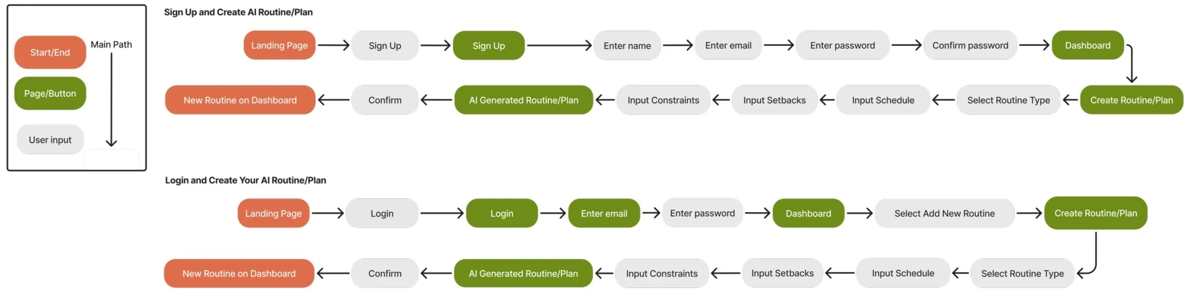
USER FLOW.
A visual representation showing how a user will complete these two tasks.
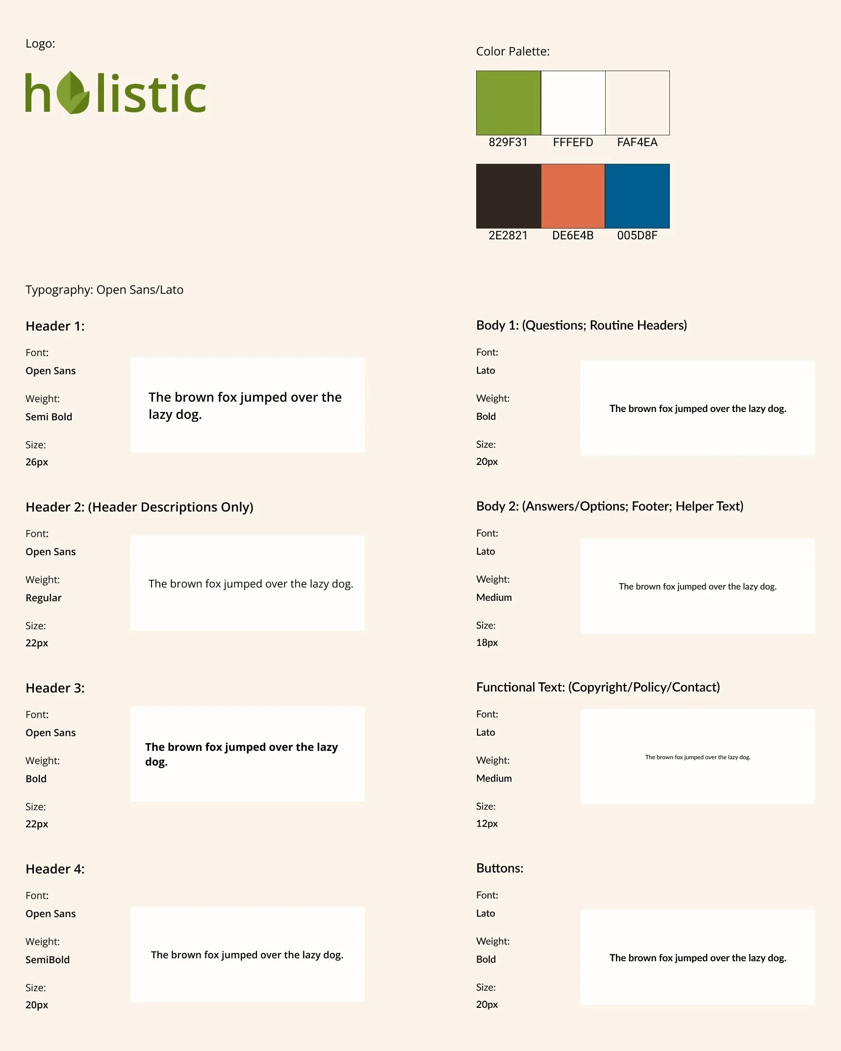
BRAND STYLE TILE.
Logo:
The leaf-shaped "O" in Holistic symbolizes commitment, empowerment, growth, guidance, and sustainability. It represents commitment to bettering all aspects of one’s health, empowerment for well-being, growth in personal development, guidance on the individual’s path, and sustainability with a routine.
Typography:
Open Sans: A clear, versatile font that enhances readability and creates a trustworthy, accessible atmosphere.
Lato: A rounded, friendly font that adds warmth and empathy to the content.
Color Palette:
#829F31 (Accent): Symbolizes growth and renewal, reinforcing the app's focus on holistic well-being.
#FFFEED and #FAF4EA (Background): Soft, warm neutrals create a calm and welcoming environment.
#2E2821 (Font): A deep, earthy brown that provides strong contrast for readability.
#DE6E4B (Primary): A warm, inviting orange that adds energy and vibrancy to motivate users.
#005D84 (Secondary): Used sparingly, this blue adds a touch of stability and focus where needed.
UI COMPONENT LIBRARY.
LO-FI WIREFRAMES.
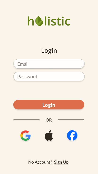
Landing Page
Sign Up
Login
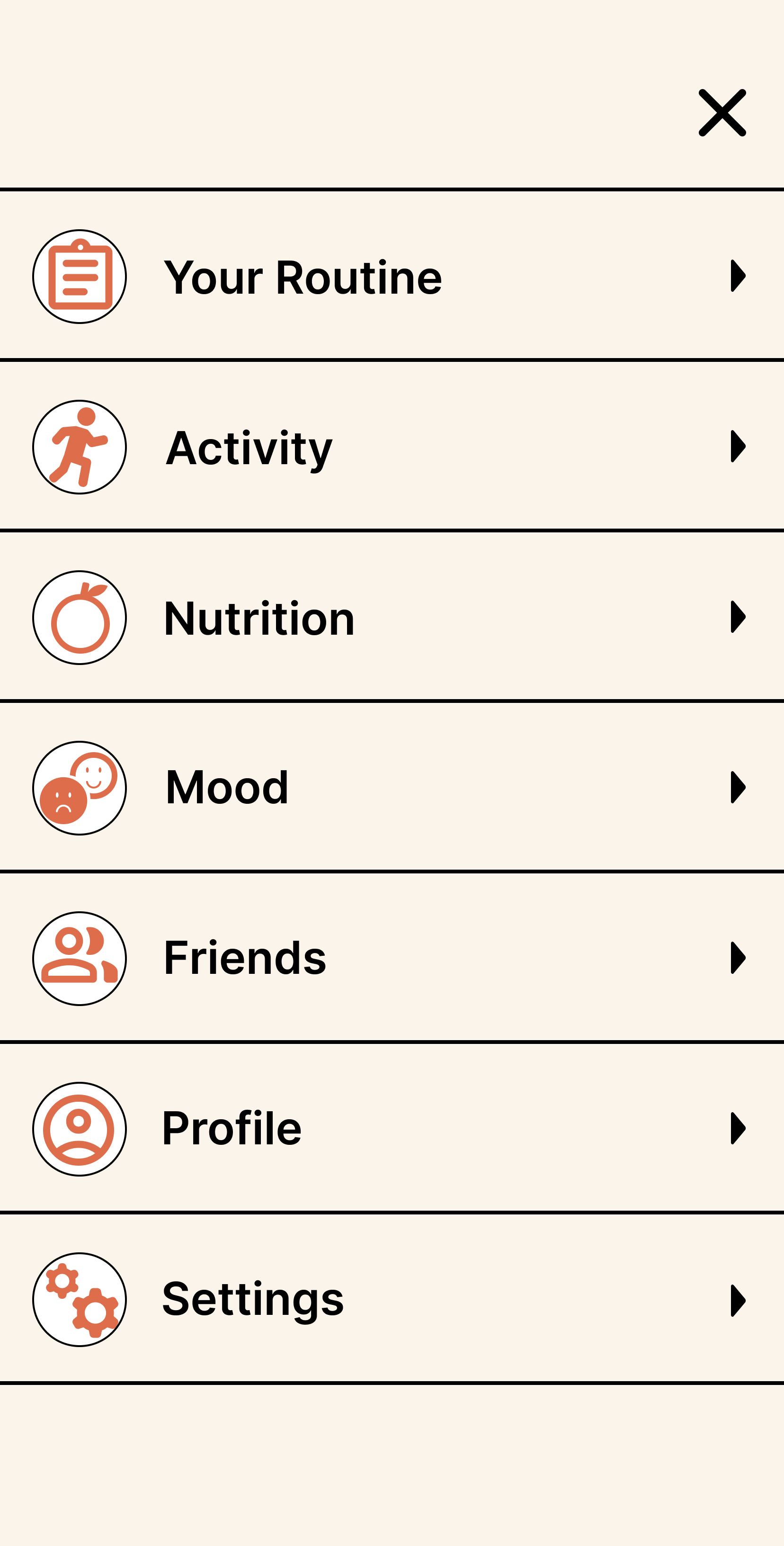
Navigation
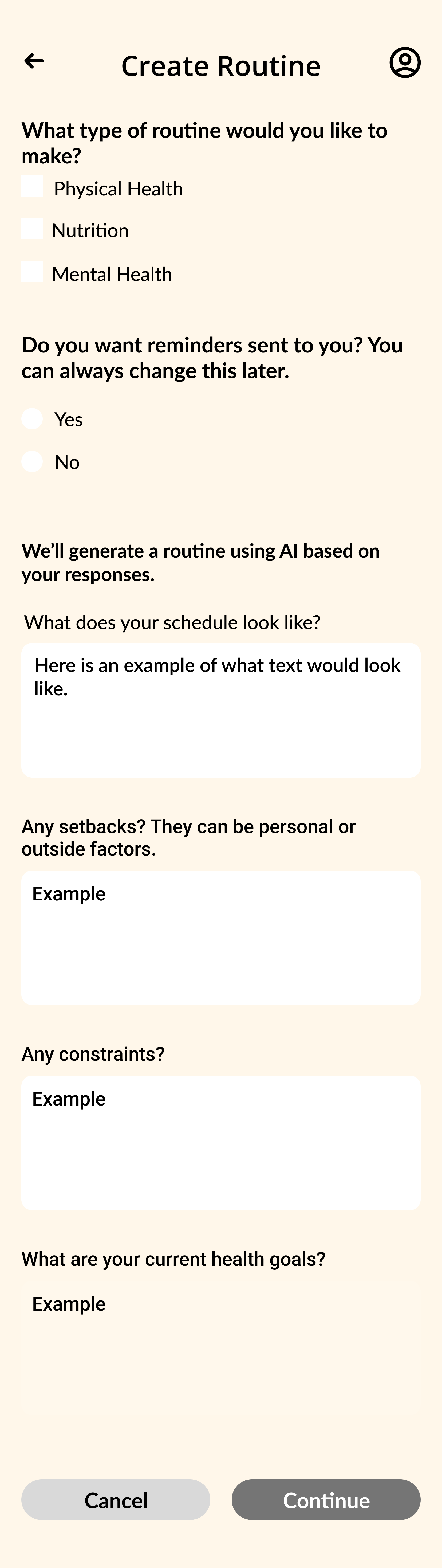
Create Routine
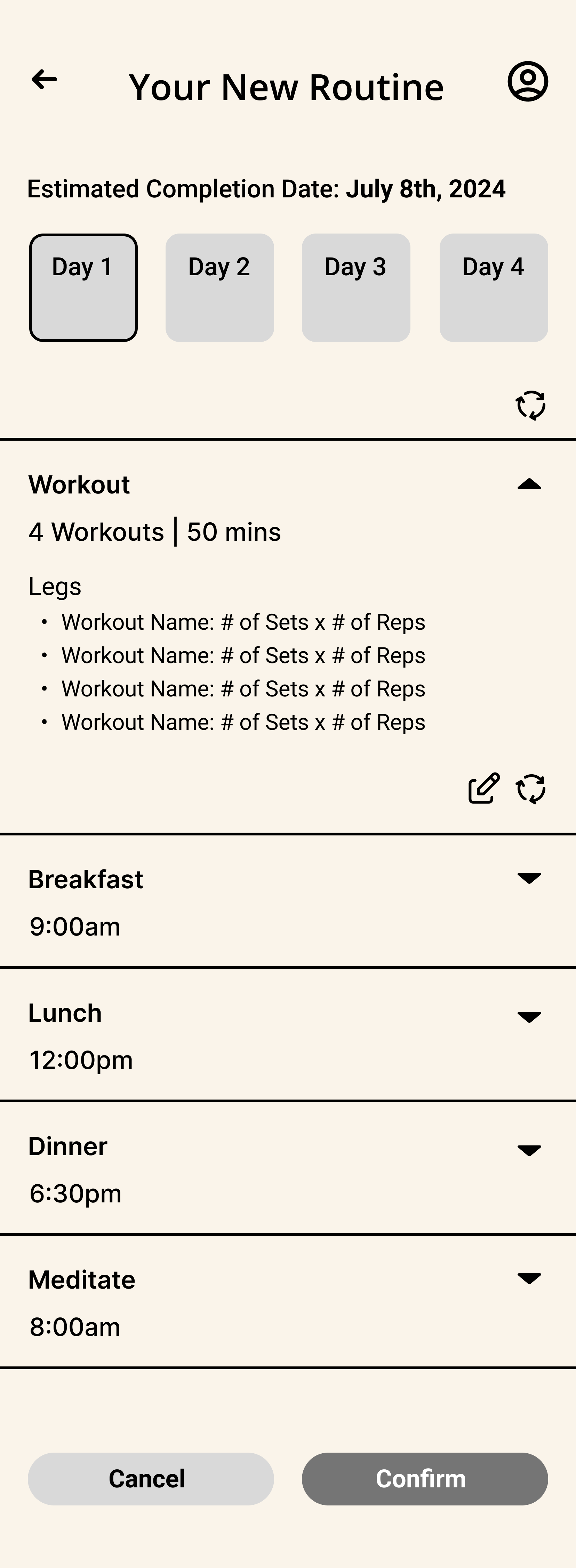
Your New Routine
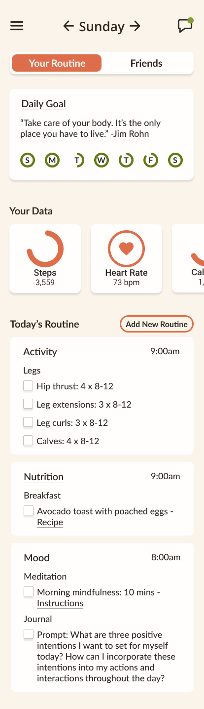
Your Routine Dash
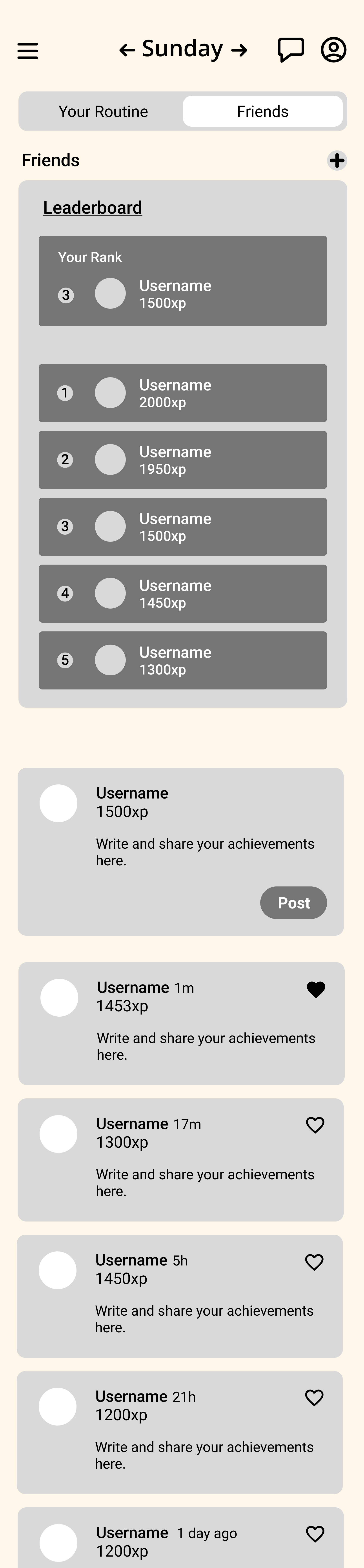
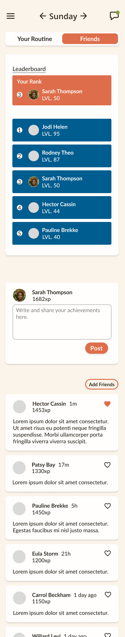
Friends Dash
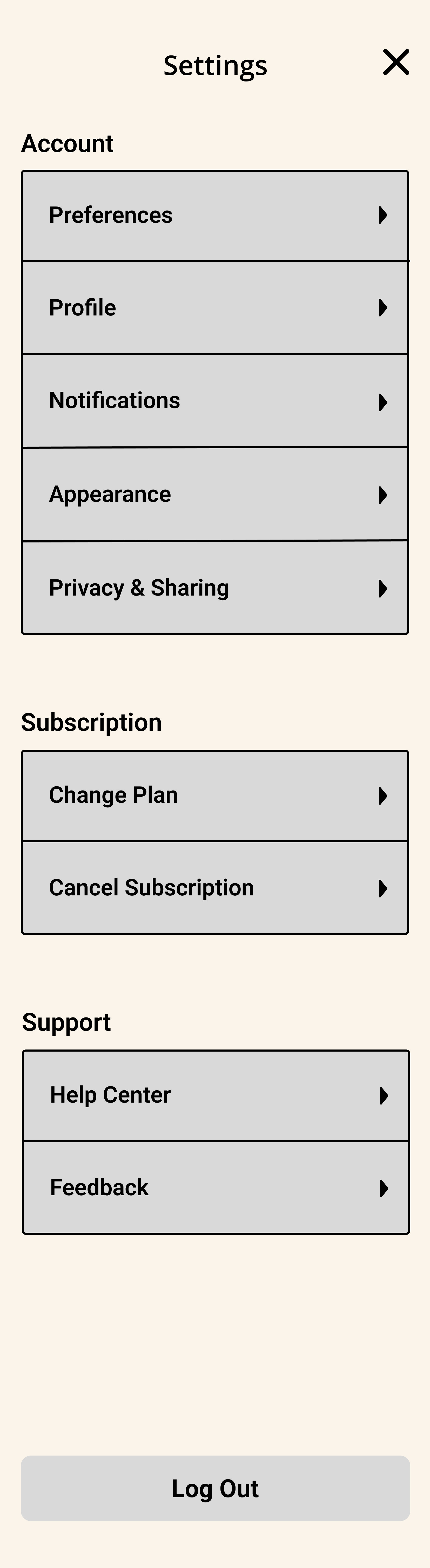
Settings
Notification Settings
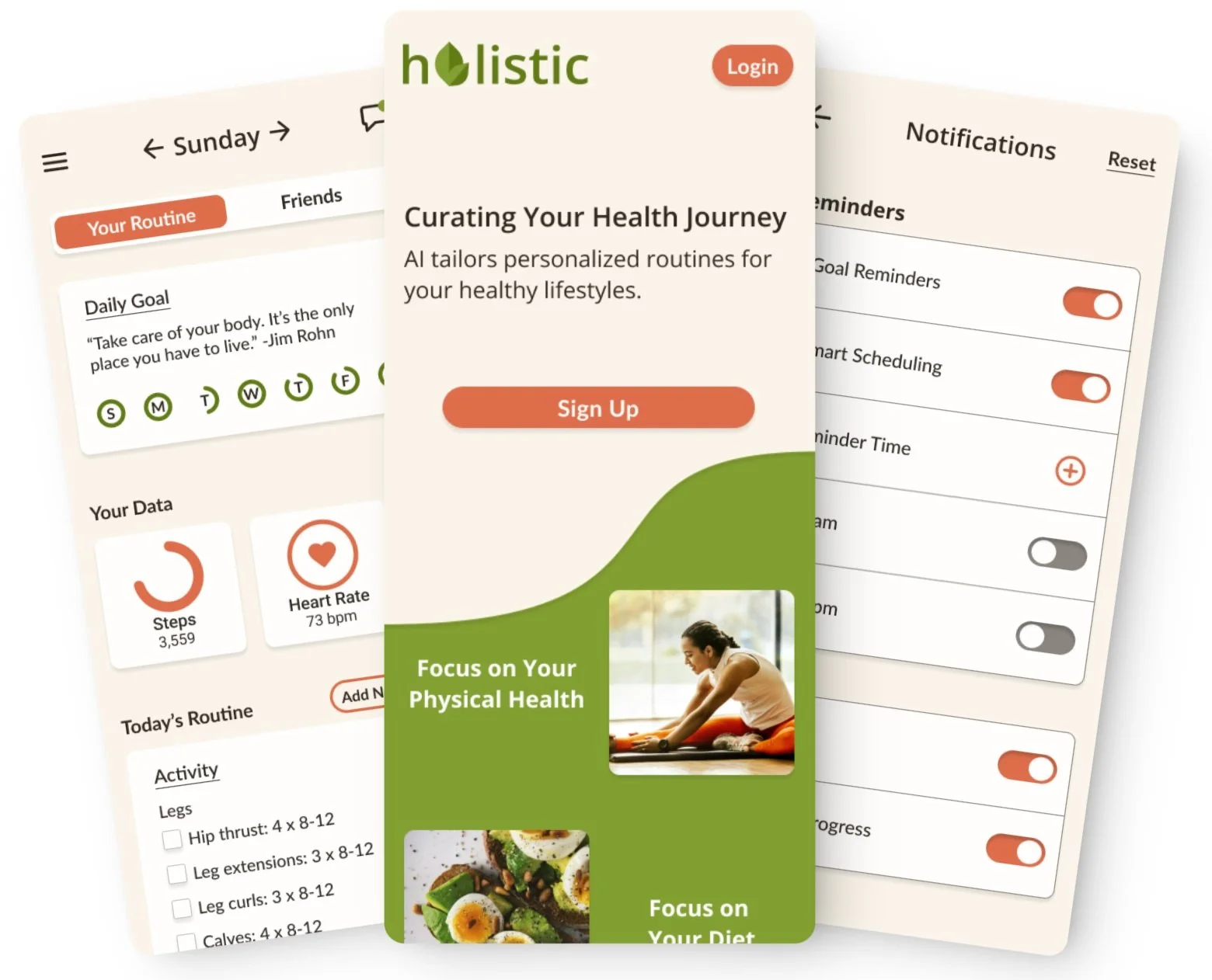
HIGH-FI WIREFRAMES.
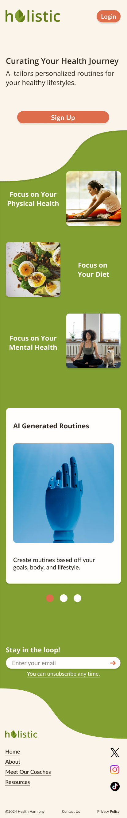
Landing Page
Sign Up

Login
Navigation

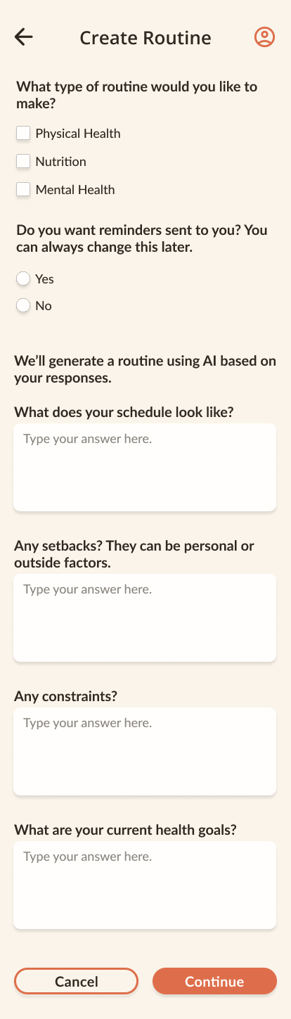
Create Routine
Your New Routine
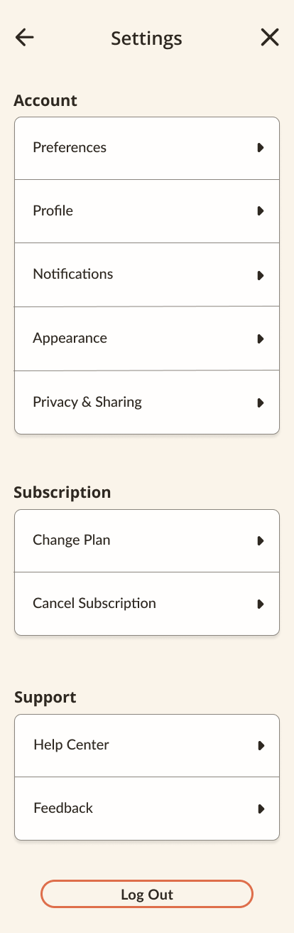
Settings
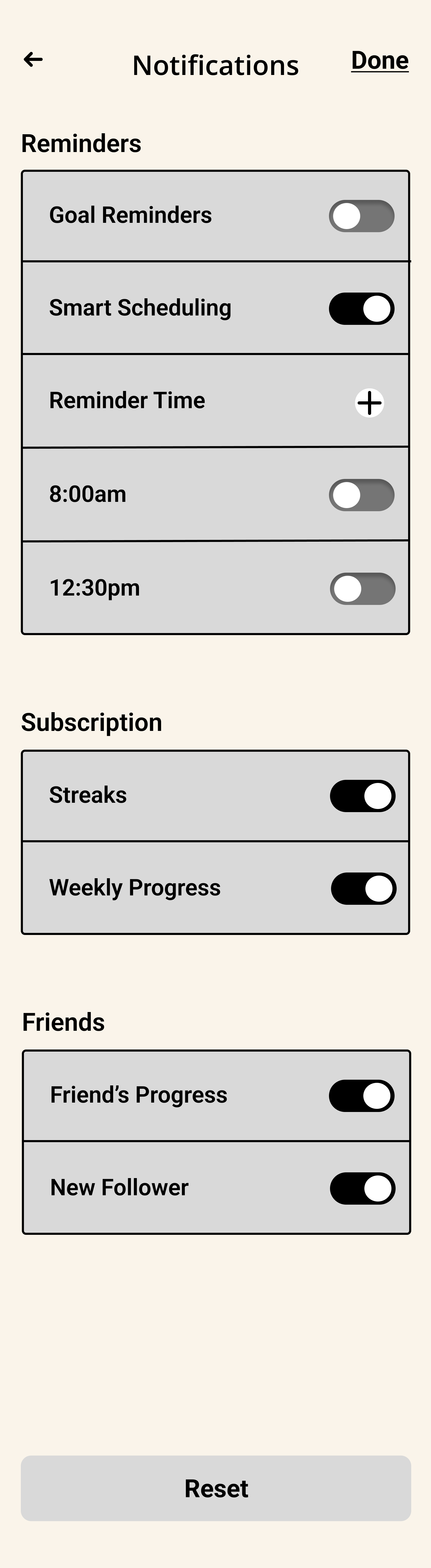
Notifications

Your Routine Dash
Friends Dash
USABILITY TEST RESULTS.
Summary
Users are tasked to create/edit their new routines after creating and account.
Users are to edit their notification settings to their preferences.
Task 1: Sign Up and Create a New Routine
Navigate Holistic’s homepage to create an account, log in, create a personalized routine using pre-written answers, regenerate the workout plan for different outcomes, and confirm your selections once satisfied.
Task 2: Notification Settings
Explore and adjust your notification settings on our website according to your preferences, creating or editing them as desired, and confirming your choices when finished.
Completion: 5/5
All users successfully completed the tasks.
One user struggled to navigate due to lack of understanding of buttons, however, after an explanation they completed the task.
Time of Completion: 4/5
The majority of users completed the tasks in reasonable times.
With the exception of the user that struggled identifying the functions of buttons/how to navigate the website.
Aesthetic: 5/5
All users expressed a liking towards the aesthetic of the responsive website.
ITERATIONS.
Iteration #1:
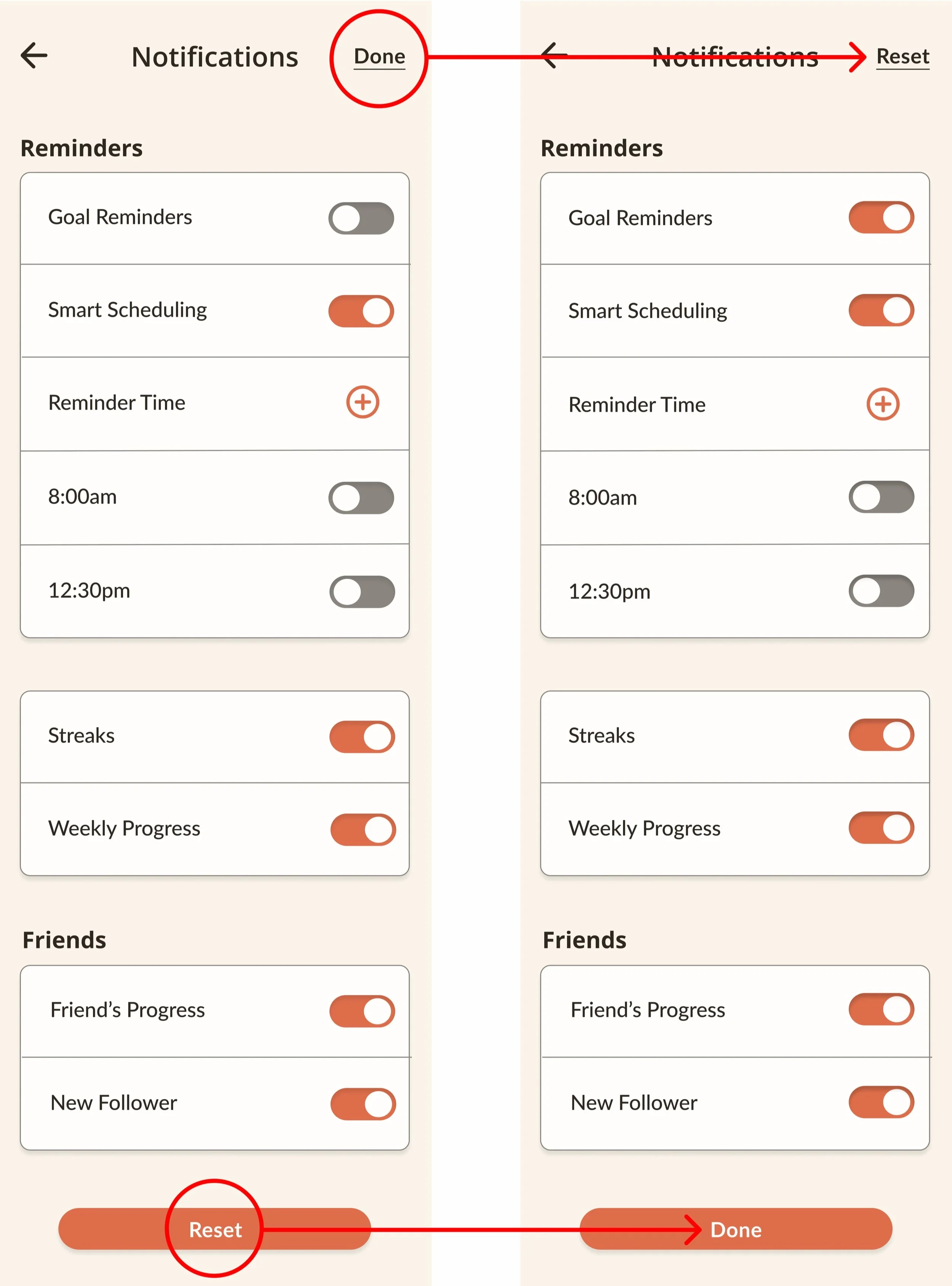
Clarify Notification Dismissal: Update the instruction from "close the notification" to "Dismiss" or add a visible close button (X).
Iteration #2:
Fully Prototype Filter Dropdowns: Since users naturally tried using the filters bar, future iterations should make those dropdowns functional.
Iteration #3:
Confirm Search Flow Consistency: While one user questioned searching for events via the main search bar, changing this behavior would disrupt LinkedIn’s existing patterns. A simple instructional cue (e.g., "Search for events by topic or location") could provide clarity.
Iteration #4:
Explore an "Attendee Visibility" Feature: Consider testing a feature that lets users see mutual connections attending an event to enhance networking opportunities.
PROTOTYPE.
PRODUCT SUCCESS.
Users successfully explored how AI can generate personalized routines based on their lifestyle. The design proved to be efficient, significantly reducing task completion time, and was widely praised for its user-friendly interface.
All users were able to successfully complete the tasks. While one user initially struggled with navigation due to unfamiliarity with the buttons, they were able to finish the task after receiving guidance.
Most users completed the tasks within a reasonable time frame, except for the user who had difficulty understanding the functions of the buttons and navigating the site.
Users consistently expressed positive feedback about the aesthetic appeal of the responsive website, noting its visual design as a highlight."
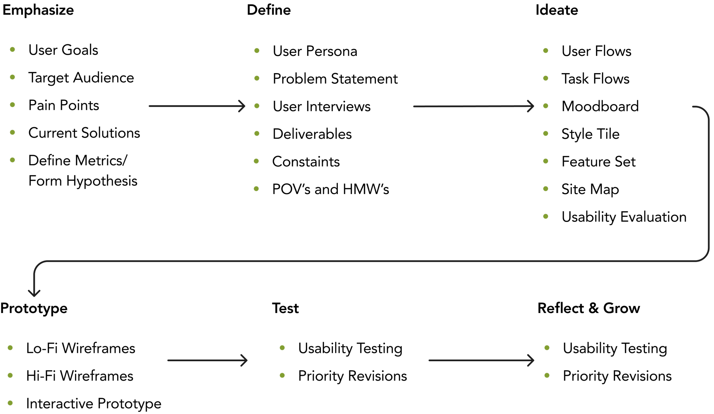
WHAT I LEARNED.
Through this project, I gained valuable insights into the design process and the importance of user feedback to reinforce the value of a user-centered approach:
Design Process: Learned the stages from research and ideation to prototyping and testing, ensuring purposeful and informed design decisions.
User Feedback: Learned the critical role of user feedback in refining and enhancing designs, leading to improved user experiences
Iterative Design: Embraced adaptability and iteration, understanding that continuous refinement leads to more polished results.
Collaboration: Recognized the importance of communication and teamwork in achieving design goals.